• Subscribe
  • Submit an Article
  • Submit a Link
  • Home
  • Advertise
  • Links
  • Contact
  • About

This is the first part of our discussion on how to export data to Excel. We will start with the simplest one; how to transfer data from a flat file (CSV, Tab delimited, PSV, etc.) to Excel. Let's know first what is a flat file...


What is a flat file?

Wikipedia described it best...

A flat file is a file that contains records, and in which each record is specified in a single line. Fields from each record may simply have a fixed width with padding, or may be delimited by whitespace, tabs, commas (CSV) or other characters. Extra formatting may be needed to avoid delimiter collision. There are no structural relationships. The data are "flat" as in a sheet of paper, in contrast to more complex models such as a relational database.
In short it's an ordinary file that stores records in sequential order.

This simple pattern of records saved in a file makes it possible for Excel to extract them and load into worksheet cells. A function is available in Excel to do it with a wizard tool.


Export To Excel

1.) Before we can export records to Excel, we need to have source file. So, let's create one by opening Windows Notepad and enter the set of data exactly as shown in the screen grab below:
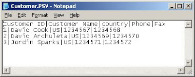


The sample records I created are list of customers. Each field should be separated by a Pipe ("|") character. After entering the string above, save the file. In my case, I named it Customer. The filename would have a .TXT extension, but since our data is pipe delimited, we should rename the extension to .PSV (Pipe Separated Value). We have now Customer.PSV.

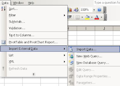
2.) Create a new Excel worksheet. On the menu, click Data>Import External Data>Import Data as shown below:


3.) This will bring out the Select Data Source window:
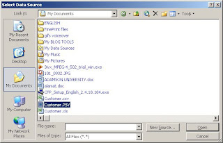


In this window, you will see many choices in the "Files of type" pull down list but you need only to choose All files (*.*) because PSV format is not included in the list. Locate the Customer.PSV then double click it.

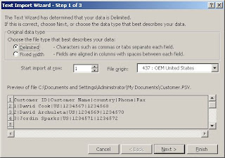
4.) The Text Import Wizard appears as shown below. Do not change the default Delimited in the Original data type as our records are delimited by a pipe character. Click Next button.


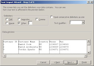
5.) The second screen of the wizard appears. Check the Other check box and put a pipe in the text field next to it. See below how. Then click Next button.


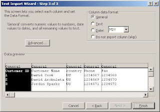
6.) The third screen of the wizard appears (see below). Here you usually indicate the data type of each column. But in the case of our sample records, we will just click Finish button.


7.) The Import Data window pops out, choose Existing worksheet since we juist created a new one and click Ok to store all the records in the worksheet as shown in the screen grab below:
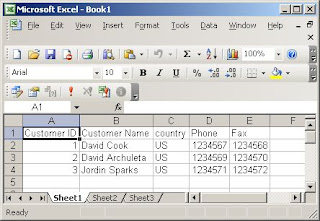


We are done.

Now you know how to export records from a text file into Excel and having these records in the worksheet you can now manipulate the data the way you want. You can pivot them to summarize and come up with useful information, or you can consolidate them with other data extracted from other source, etc.

In my next post, we will discuss consolidation of records from different files using VBA programming.

Happy Weekend :)

Read More
Posted by Catholic Prayers on Friday, August 22, 2008

I will give you a very simple Pareto chart example. Create a new workbook and enter exactly the same figures in the screen shot below:


The worksheet above is an example of list of reasons why you lost business proposals or quotes to other competitors. Column A has the reason descriptions. Column B has the corresponding number of times with that lost reasons in Column A. Column C has the percentages. Column D is the running percentages of Column C.

Highlight the range A1 to A6. Press Ctrl key simultaneously on highlighting the C1 to D6. Then click the Insert>Chart in the menu. The chart wizard will appear on the screen for you to choose the kind of chart that you want to create. Choose the Bar Chart. Click the finish button to display the chart equivalent of the table you selected. Right-click once one of the Running % bar and choose Chart Type in the menu that appears. The Chart Type window will pop out and then you can change Running % from bar to line type. The chart should look like the screen shot below:


Now you know how to create your own Pareto chart, but you probably have questions at the back of your head right now. And you might be asking the following questions:

  1. I can't see the 80% and 20% in the chart so why is it called 80-20 rule based?
  2. How this chart can help the business?
  3. How this chart can be applied with a database with large repository of data?
I will try to answer these questions the best that I can.

1. ) I can't see the 80% and 20% in the chart so why is it called 80-20 rule based?

Answer: I intentionally made the sample Pareto chart an imperfect one to make it looks like a realistic one. The 80-20 rule doesn't mean that exactly 20% of the reasons are 80% of the root causes of losing businesses. It simply states the principle that a few of the reasons causes the majority of why you are losing, not exactly 20%. That's why the phrase "the vital few and the trivial many" was coined after this rule.

2.) How this chart can help the business?

Answer: Considering the example above, you can easily see that most of the reasons in losing a business are Price and Customers' Lack of Fund. The two reasons when combine together have more than 50% and simply means they are major root causes of your loses. Knowing that information, you can focus in those problem areas; you can act and fix on those situations. Once the problems are solved in those areas, you also solved more than 50% of the root causes and surely will improve your business performance and profitability. Then you can generate again another Pareto chart to know if the situation has changed and then focus again in the majority root causes. It is a continuous cycle of knowing the big problems and solving them.

3. How this chart can be applied with a database with large repository of data?

Answer: This is the most important part of our discussion. In your company, you surely have a lot of records sitting in your Excel files, Access files, SQL Server, Oracle, etc. How can we use them to create a Pareto chart.

Our example above is very simple that you don't need to convert it to Pareto chart to know what are the majority of the problems. But imagine, for example, if you have many branches, let's say 30 branches with 10 sales persons each that have multiple prospective customers and they are recording those leads pipeline in Excel to monitor quote status, amount, products, etc. Do you think you can easily come up with a Pareto chart with many Excel files in different locations? No, it's not that easy to consolidate those data. You need to have a procedure in implementing the consolidation and a good Excel macro program to automate the stitching of the records.

Another good example is: you are in a manufacturing company and having an ERP system. You want to create a Pareto chart because you want to know from which of the 60,000 raw materials that take most of your inventory investments. It is because you want to focus on them to make sure that majority of your investment is taken care of by keeping an eye on the correct reorder point, correct stock handling, good supplier selection, proper purchasing approval, etc. And with it, you can delegate the "trivial many" to your subordinates.

In my subsequent posts, I will demonstrate to you a different methods of how to export to excel records from different platforms (mostly with VBA programming); flat file, Excel, Access, SQL Server (OLAP or not) and Oracle. It will be a series of posts as I can not tackle them all in a sigle posting.

Subscribe now. You can see below how.

Read More
Posted by Catholic Prayers on Friday, August 8, 2008

The Pareto Chart, also known as the Pareto Analysis, ABC Analysis, or 80-20 Analysis, is based on the principle of "the vital few and trivial many" developed by Vilfredo Pareto, an Italian economist born in 1848. I'm not going to discuss here his life; you can already research on that in Wikipedia or Google. What you will read here is about the importance of his statistical findings, the 80-20 rule, that you can apply in almost every aspect of your life, especially in business. And in business, I will give you an example in my next post on how can you make the Pareto chart as a decision support tool by digging and using the data that you already have in your existing database. Yes, the raw data residing in your database, whether it's an Excel data, MS Access data, OLAP data, SAP data, or Oracle data, are just sitting there waiting to be dug up and be transformed to an information that will greatly help you to improve your business focus, operation, and eventually profitability.

The 80-20 rule means that approximately 20% of everything is either better or worse than the 80%. For example, 20% of your retail products are making 80% of your profitability. 20% of your sales agents are giving the 80% of the total sales. And here's a more enlightening; in an equally managed inventory of raw materials, 80% of your inventory investment goes to a certain small group of products that need more attention than the 20% that you can delegate to someone else. There are actually limitless applications to this theory. All you have to do is think outside the box and hard.

In the next post, the example I promised you will be discussed and in the subsequent posts thereafter, the different way to extract data from different sources (Flat file, Access, SQL Server, SAP and Oracle E-Business Suite) will be discussed. So be in the loop. Subscribe now. You'll see below how.

Read More
Posted by Catholic Prayers on Saturday, August 2, 2008

Followers